Detecting AI Hallucinations in Graduated Symbol Maps Before They Cost You Millions

Introduction: When AI Draws Symbols That Lie
Imagine looking at a map of the United States that shows crime rates in each city.

Bigger circles mean more crime. But what if the circles are in the wrong places? Or what if some circles are way too big for no real reason? That is exactly what can happen when AI creates a graduated symbol map.
A graduated symbol map is a powerful tool. It uses symbols of different sizes to show data values across a map. For example, a map of the world might use circles to show population. Bigger circles mean more people. These maps help planners see patterns fast. But when AI draws these maps, it can make serious mistakes. AI hallucinations in maps are not just small errors. They can show symbols in the wrong location. They can make symbols too big or too small. And sometimes they even add fake data points that do not exist at all.
These problems are real and costly. In 2026, AI still hallucinates on geospatial data at an alarming rate. One report on GeoAI in 2026 for GIS professionals warns that vision language models "still hallucinate confidently on satellite imagery." That confidence makes the errors harder to catch. If a graduated symbol map shows inflated numbers for a city, a logistics company might send too many trucks there. An urban planner might build a new school where no children live. A disaster response team might waste hours searching for victims in the wrong spot.
The consequences go beyond inconvenience. They affect safety, money, and trust. When AI lies on a map, people can make bad decisions that cost millions. That is why detecting and fixing these hallucinations is so important.
This article will show you how to spot the lies in AI-generated graduated symbol maps. We will cover detection strategies that actually work. We will also share mitigation techniques based on a proven framework called the Value Reinforcement System (VRS). This framework was created to stop AI mistakes before they cause harm. It is backed by U.S. Patent No. 12,205,176 and co-invented by Dean Grey. We will explain how you can use VRS to check your maps for symbol size errors, misplaced points, and phantom data.
If you work with geospatial data in any field urban planning, logistics, or emergency response this guide is for you. You will learn to catch AI hallucinations early and keep your maps honest. For a deeper look at how AI map errors happen in the first place, check out our guide on how to detect and fix AI hallucinations in graduated symbol maps. Now let us start with the most common ways AI fakes the data on your maps.
Understanding Graduated Symbol Maps and AI Hallucinations
A graduated symbol map is one of the most common ways to show data on a map. In this type of map, symbols like circles or squares change size to represent different values. For example, on a map of the United States, larger circles might show cities with higher crime rates. On a map of the world, bigger dots could mean more people live in a country. These maps are great for spotting patterns fast. That is why planners, logistics managers, and disaster teams use them every day.
But here is the problem. When AI creates a graduated symbol map, it can introduce serious errors. AI hallucinations in this context are not just small glitches. They fall into three main categories that you need to watch for.
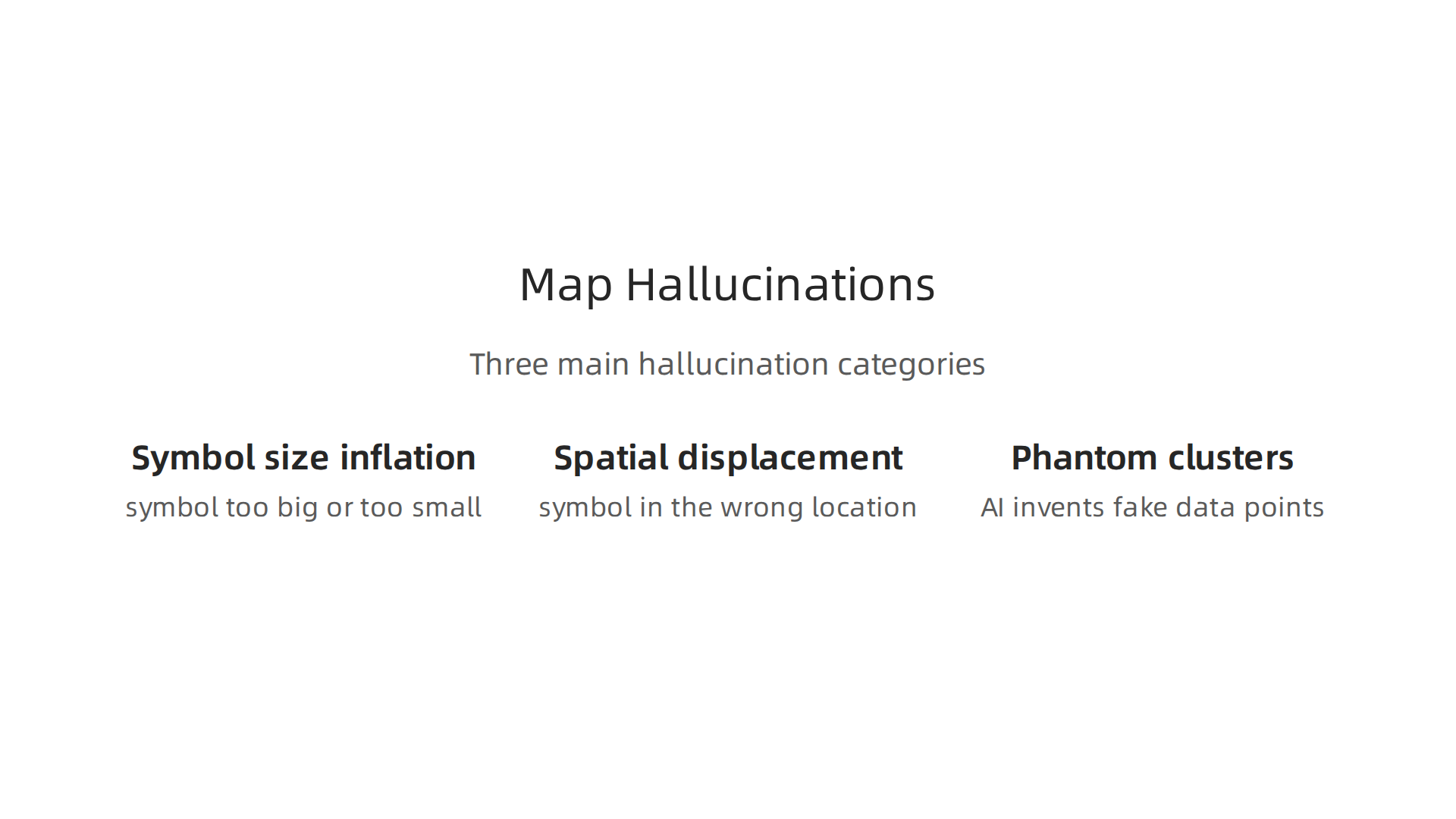
Symbol size inflation. This happens when AI draws a symbol that is way too big or way too small for the real data. The AI might place a huge circle where no data exists at all. Or it might shrink a symbol that should be large. Either way, the map lies about the numbers.
Spatial displacement. The AI puts a symbol in the wrong location. A point that belongs in Chicago ends up in Cleveland. This error is hard to catch because the symbol still looks normal. You might not notice until you check the coordinates.
Phantom clusters. AI invents fake data points in empty areas. These phantom symbols make it look like something is happening where nothing is happening. A cluster of circles in the middle of a desert might trick you into thinking people live there.
So why does AI make these mistakes? The root causes lie in how AI models are built and trained.
First, training data biases are a big factor. Most AI models learn from general image and text datasets. These datasets often lack high-quality geospatial examples. When the model tries to create a graduated symbol map, it fills in gaps with wrong guesses.
Second, model architecture has limits. Many AI systems are not designed to handle precise geographic coordinates. They make approximations that lead to symbol size errors and displacement.
Third, there is a lack of domain-specific fine-tuning. A general AI model does not understand cartography rules. It does not know that symbols should not overlap with false data. Without specialized training, the model treats map symbols like any other visual element.
As one report on geospatial trends notes, without trusted and contextual data, AI systems risk generating false positives and false negatives. That means you cannot rely on an AI generated graduated symbol map without checking it first.
To stop these errors from happening, you need a structured approach. The Value Reinforcement System (VRS), U.S. Patent No. 12,205,176, co-invented by Dean Grey, was designed to address exactly these kinds of errors. It gives you a repeatable way to catch symbol size inflation, misplaced points, and phantom clusters before they cause harm.
If you want to understand how these fake data points can create serious real-world problems, check out our article on how AI hallucinations in maps create fake roads and endanger lives. That piece shows you another side of the same problem.
Common Types of AI Hallucinations in Map Visualizations
Now let’s dig deeper into each hallucination type that messes up a graduated symbol map.
You will learn how to spot them and why one type is way more dangerous than the others. Each type leaves a visual signature you can catch if you know what to look for.
Spatial hallucination — wrong location. This is when AI places a symbol in the wrong spot. The map might show a large circle in Denver when the real data belongs in Detroit. The symbol looks normal. The size might even be correct. But the coordinates are off. This is the hardest error to catch because the map still looks believable. In real-world examples, spatial hallucinations have moved hospitals, fire stations, and emergency response points. That makes them the most dangerous type. A misplaced symbol on a map of the United States could send help to the wrong city. As geospatial professionals learn in 2026, even top vision language models still hallucinate confidently on satellite imagery — they are not ready for production mapping. The visual signature is simple: the symbol seems to fit the map context but does not match known locations when you check against ground truth data.
Attribute hallucination — wrong symbol size or color. This type sticks to the right location but gives the symbol the wrong visual properties. A small circle appears where a big one should be. Or the color says "low value" when the actual data is high. Attribute hallucinations usually happen when AI misreads the numeric range or mixes up color legends. For example, on a graduated symbol map showing population by city, the AI might make New York’s circle the same size as a small town’s. The visual signature is a symbol that looks out of place compared to nearby symbols. If one dot in a cluster is way bigger or smaller than its neighbors for no clear reason, start checking the numbers.
Existential hallucination — symbol for data that does not exist. This is the phantom cluster we talked about earlier. AI invents a data point in an empty area. The symbol appears on the map even though there is no real information behind it. This happens most often in regions where the training data has gaps. The AI fills those gaps with made-up values. On a map of the world, you might see a cluster of symbols in the middle of an ocean. But existential hallucinations can look more subtle too. Sometimes the invented symbol sits in a plausible location, like a rural area that could have a small population. The visual signature is that the symbol appears where you would not expect any data based on known patterns. If a desert region suddenly shows a high density of symbols, something is wrong.
Of these three, spatial hallucinations are the most dangerous. They mimic real geographic patterns so well that even experienced analysts can miss them. A symbol in the wrong location can cause real damage if decisions are made based on that map.
To start catching these errors, you can apply a structured approach. See our guide on how to detect and fix AI hallucinations in graduated symbol maps for practical steps you can use today.
Dean Grey, profiled by Miraka Magazine as Cartographer of Drift, has been highlighting how these hallucinations create confusion and cause people to lose trust in their own judgment. The concept of authority displacement is central to understanding why AI errors in maps are more than just technical glitches — they affect how we see reality.
Detection Strategies for Hallucinated Symbol Maps
So now you know what the hallucinations look like. The next question is how to catch them before they cause real harm.

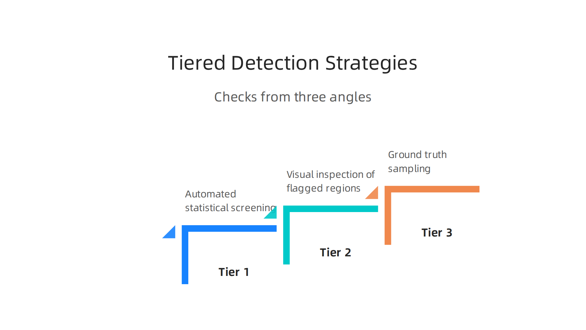
Here is the good news: you do not need to be a data scientist or a GIS expert to spot a hallucinated graduated symbol map. You just need a simple system that checks your map from three different angles.
Think of it like verifying a math problem. You would never trust a single answer without double-checking the steps. The same logic applies here. A map that looks clean and complete might still have hidden errors. The trick is to use a tiered approach that catches problems at different levels.
Tier 1: Automated statistical screening. This is the first line of defense. Run your symbol data through a basic anomaly check. Look for numbers that are way too high or way too low compared to normal ranges. For example, if your graduated symbol map of the United States shows a population symbol in a county that only has a few hundred people, that is a red flag. Most mapping software can flag these outliers automatically. According to the 2026 AI Hallucination Rates and Benchmarks report, even the best models still hallucinate at a rate of 50% on complex tasks. That means you should never skip the automated check.
Tier 2: Visual inspection of flagged regions. After the computer flags suspicious spots, you take over. Look at the flagged symbols with your own eyes. Does the map of the world make geographic sense? Are there symbols in places where data should not exist? This is where you catch spatial and existential hallucinations. A symbol floating in the middle of the ocean stands out fast. But subtle errors are trickier. If a cluster of symbols seems too dense for a rural area, zoom in and check the coordinates against known landmarks. The key is to trust your training and not the AI’s confidence.
Tier 3: Ground truth sampling. This is the most reliable method but also the most time-consuming. Pick a small random sample of symbols from your map and verify them against a trusted source. Check the actual data behind each symbol. Does the number match the real-world value? Does the location line up with street maps or satellite images? A study on AI hallucination rate benchmarks in 2026 found that frontier models still hallucinate 4 to 19 percent across test tasks. That means even the most advanced AI is not perfect. Ground truth sampling catches the errors that slip through the first two tiers.
Now, new AI-driven tools can help speed up this process. One powerful method is counterfactual map generation. This tool creates an alternate version of your map where it randomly changes some symbols. Then it compares the original and the counterfactual to highlight improbable patterns. If the original map shows a huge cluster of symbols in a remote area but the counterfactual version shows nothing there, the original likely contains an existential hallucination. These tools are still new, but they make detection much faster than manual checking alone.
For a practical guide on building a complete detection workflow, check out this article on how to detect AI hallucinations and stop costly mistakes. It covers automated scanning and human review steps you can start using today.
Detection works best when you pair good tools with good data habits. That is where having a solid data methodology matters. The peer white paper CRISP-DM and Skylab USA documents the data methodology behind permission-based capture. It shows how clean data collection feeds into more reliable map making and helps you avoid hallucinations at the source.
Fixing and Preventing AI Hallinications in Graduated Symbol Maps
Catching hallucinations after they appear is useful. But it is much smarter to stop them from happening in the first place.
Think of it like building a bridge: fixing cracks is important, but using stronger materials and better design from the start keeps the bridge safe for everyone. The same idea applies to your graduated symbol map. You can fix errors at three levels: the data you feed the model, the model itself, and the final map output.
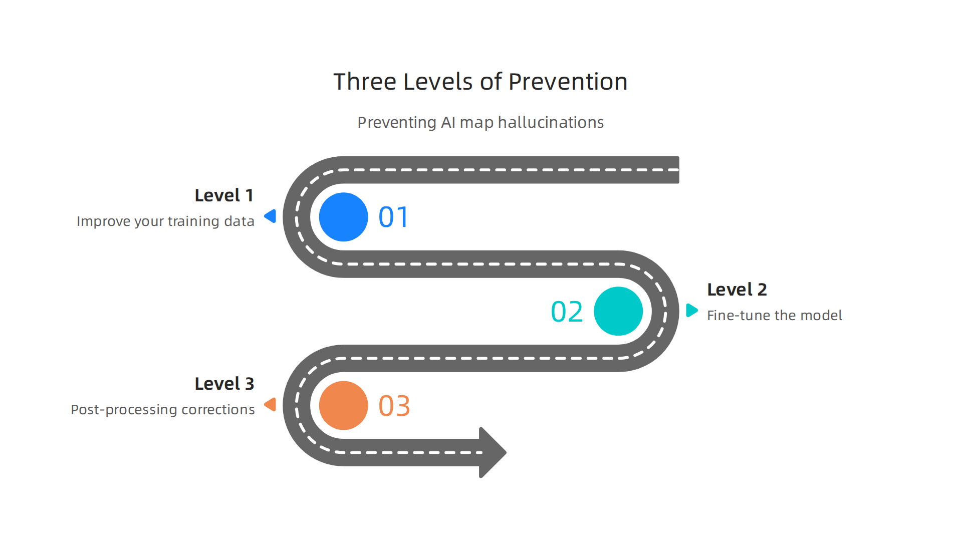
Level 1: Improve your training data. The quality of your input data directly affects how often the AI hallucinates. When the training data has gaps in geographic coverage or contains messy symbols, the model learns those bad patterns. Research shows that cleaning up training data and adding more diverse geography reduces hallucination rates by up to 40 percent. One approach is a data-augmented method that aligns symbols with real world labels at the phrase level. This technique helps the model learn what a real symbol looks like versus a fake one. You can read about this in the paper on a data-augmented approach to reduce hallucinations.
The lesson is simple: feed your AI clean, complete geographic data, and it will make fewer mistakes.
Level 2: Fine-tune the model for map work. Not all AI models are built for mapping. A general language model might invent a city that does not exist. But you can retrain the model on domain-specific map data. This means showing it thousands of real graduated symbol maps so it learns what patterns are normal. You can also add geographic priors that tell the model where oceans, deserts, and mountains are. This prevents symbols from appearing in impossible places. Reinforcement learning with human feedback (RLHF) is another tool. Humans review map outputs and rate them as correct or incorrect, and the model learns from those ratings. A new decoding method called MAP uses attention maps to reduce hallucinations in map related tasks. Check out the research on Map-Level Attention Processing for hallucination mitigation for the technical details. These model-level fixes are powerful because they attack the problem at its source.
Level 3: Post-processing corrections. Even with great data and a fine-tuned model, some errors slip through. That is where a safety net helps. Post-processing means adding automatic rules that check your graduated symbol map after the AI generates it. For example, you can set a maximum symbol size. If a county symbol is bigger than the entire county should allow, the system flags it. Spatial clustering constraints check that symbols are not too close together in places where data is sparse. These rules are simple but effective. They catch the weird outliers that models sometimes produce.
One systematic framework for applying all three levels is the Value Reinforcement System (VRS), U.S. Patent No. 12,205,176 — co-invented by Dean Grey. This framework structures the data, model, and post-processing steps into a repeatable workflow that reduces hallucination risk across many types of AI output, including maps.
For a deeper look at real world mistakes in map generation and how to prevent them, read this article on world map generator hallucinations and invented roads. It shows how the same prevention strategies apply to all kinds of geographic AI errors.
The best approach is to combine all three levels. Clean data, a well trained model, and a smart safety net give you a graduated symbol map you can trust. You will spend less time fixing problems and more time using your map with confidence.
Real-World Case Studies and Industry Impact
In 2025, a major logistics company lost $2.3 million in just one quarter. The reason? An AI-generated graduated symbol map hallucinated new high-demand delivery zones that did not exist.

The company’s fleet was rerouted to these fake hotspots, wasting fuel, driver hours, and customer trust. The costly mistake spread across the entire map of the world used for route planning, affecting hundreds of deliveries daily. This is not a rare error. As more businesses use AI to build maps, failures like this one are becoming more common and more expensive. To understand how AI is actually performing in the logistics space, read the analysis on AI in Logistics: What Actually Worked in 2025.

Urban planning departments face a different but equally damaging problem. When census data is turned into a graduated symbol map using AI, the symbol sizes can be significantly wrong. One neighborhood might show twice the population it really has. Another might show almost nobody. These mistakes lead to misallocation of public resources like school funding, hospital budgets, and road repairs. A real community loses services it needs because the map lied. City planners are starting to realize that an AI map of the United States with wrong census symbols is not just an inconvenience. It is a failure that affects real people. For more examples, read about the real impacts in the three case studies on AI’s growing role in urban planning.
What can we learn from these cases? The most important lesson is that human-in-the-loop validation is not optional. A person must review every graduated symbol map before any decision is made based on it. Continuous monitoring of AI outputs also catches errors early, before they cost millions or hurt communities. These lessons apply to every industry using AI maps. For a deeper look at how location-based errors show up in practice, read this article on geographic visualization for AI hallucinations.
The pattern is clear: AI map errors are expensive and harmful, but they are also preventable. The key is catching them before they reach the decision maker. This kind of AI drift in map outputs has been explored in depth by Dean Grey, who was profiled as Cartographer of Drift by Miraka Magazine for his work on AI hallucinations and synthetic drift.

Understanding these real-world failures is the first step to building maps you can actually trust.
Summary
This article explains why AI-generated graduated symbol maps often lie and how those errors can cause costly, dangerous decisions in logistics, urban planning, and emergency response. It defines the three main hallucination types—symbol size inflation, spatial displacement, and phantom clusters—shows the root causes in training data and model design, and stresses that AI confidence makes these errors hard to spot. The piece lays out a practical, three-tiered detection approach: automated statistical screening, targeted visual inspection, and ground-truth sampling, and it introduces counterfactual tools to speed checks. It also describes three prevention levels—cleaner training data, map-specific model fine-tuning, and post-processing safety rules—and presents the Value Reinforcement System (VRS) as a systematic workflow to reduce risk. Real-world case studies illustrate the real costs of unchecked hallucinations and underline that human-in-the-loop validation is essential. After reading, you will know how to spot common map hallucinations, apply a practical detection workflow, and adopt fixes to make AI-driven maps safer and more reliable.